The Arcane: A Mystical Logo for a Supernatural Blog
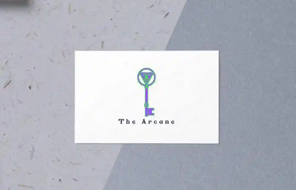
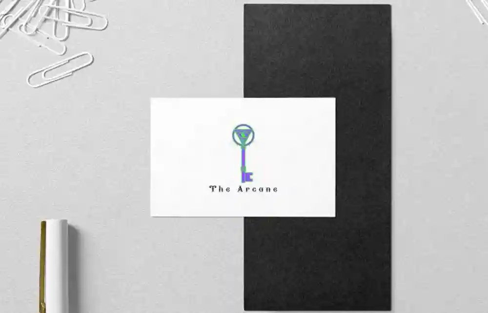
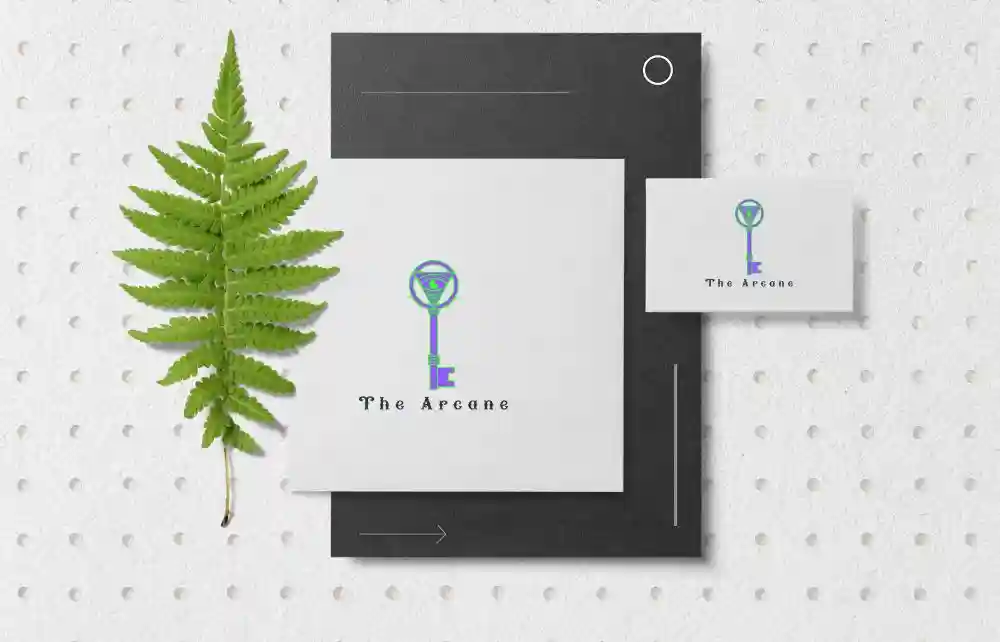
The Arcane logo was crafted as the centerpiece for a blog dedicated to supernatural and occult interests. The Logo Design is designed to resonate with themes of mystery and discovery, this logo symbolizes the “key” to unlocking hidden knowledge and the allure of the unknown.
The Arcane Logo Design: Colors That Inspire
Why Purples and Greens Were Chosen
The chosen color palette of purples and greens enhances the mystical tone. Purple represents wisdom and the esoteric, while green symbolizes growth and the natural world. Together, these colors create a striking yet balanced aesthetic that perfectly aligns with the blog’s focus on the supernatural.
Key Elements of The Arcane Logo
The Symbolic Power of the Key
At the heart of the logo lies a symbolic key—a timeless representation of unlocking secrets and delving into mysteries.
Intricate Details and Modern Appeal
The key’s intricate design incorporates subtle flourishes, giving it an ornate and otherworldly feel while remaining clean and modern. This detail enhances its visual appeal and makes it versatile for use across various mediums.
Designed for Versatility: Adapting The Arcane Logo
Horizontal Logo for Digital Spaces
To ensure flexibility, we also designed a horizontal version of the logo specifically tailored for the blog’s website. This adaptation ensures seamless integration with their digital presence while maintaining the logo’s integrity and visual impact.
A Storytelling Tool
How the Logo Aligns with the Blog’s Mission
The Arcane logo is more than just a visual identifier; it’s a storytelling tool. It captures the essence of the blog’s mission to explore the supernatural, inviting readers to embark on a journey of discovery.
Establishing a Cohesive Brand Identity
Whether used in its primary or horizontal form, this logo establishes a cohesive and compelling brand identity, leaving a lasting impression on its audience.
Conclusion: The Arcane Logo’s Legacy
This project was a true collaboration of creativity and purpose. The Arcane logo perfectly embodies the enigmatic spirit of the blog, combining a captivating design with practical adaptability. It’s a symbol of mystery, inviting curiosity and exploration.
For further insights into color symbolism in design, explore this comprehensive guide: Color Symbolism – The Interaction Design Foundation.