Crafting a Distinctive Identity for Mobility & Disability
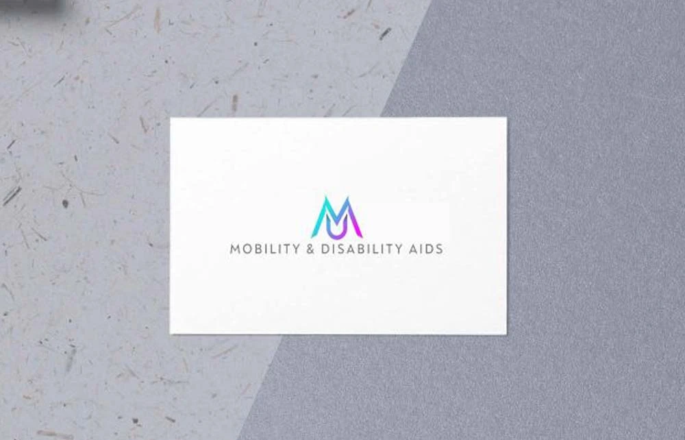
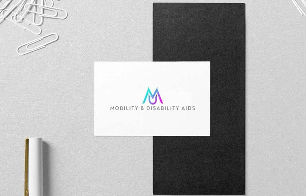
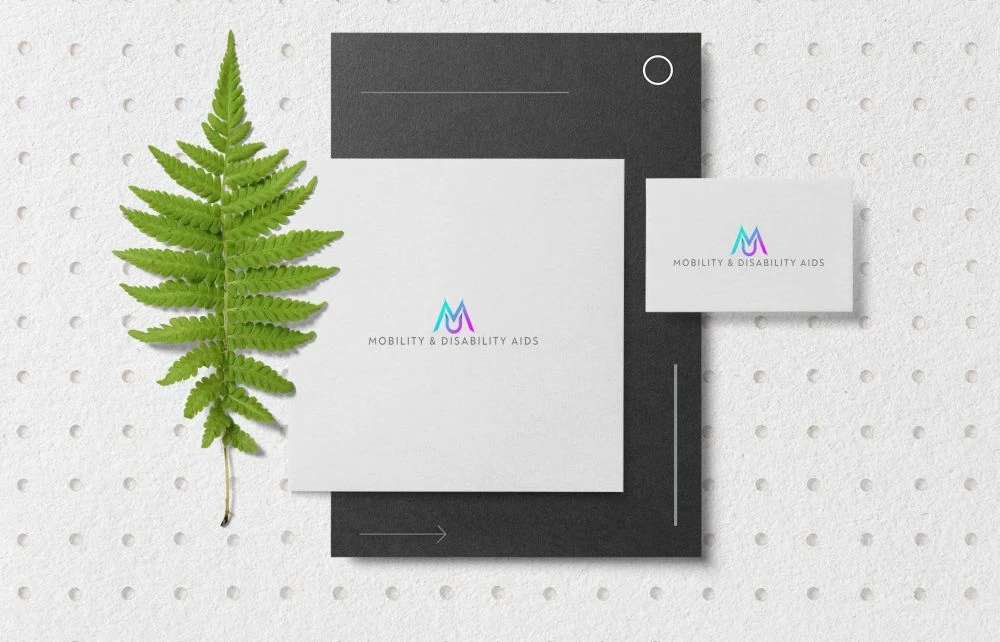
Mobility & Disability, a company dedicated to providing comprehensive services and products for individuals with mobility challenges, sought a logo that would effectively represent their mission and resonate with their target audience. The objective was to create a colorful logo that seamlessly merged their signature pink and blue hues, ensuring clarity and readability across various platforms, including their website and social media channels. The final design features a crisp image paired with an easy-to-read font, offering a modern look that distinguishes them within their industry.
Mobility & Disability Design Elements: Harmonizing Color and Clarity
Merging Pink and Blue: Symbolizing Unity and Trust
The strategic combination of pink and blue in the logo serves to symbolize unity and trust. Pink conveys compassion and care, reflecting the company’s commitment to enhancing the quality of life for their clients. Blue represents reliability and professionalism, underscoring their dedication to providing dependable services. The harmonious blend of these colors creates a visually appealing and meaningful representation of the brand’s values.
Crisp Imagery and Readable Typography: Ensuring Accessibility
The logo incorporates a clean and crisp image that is easily recognizable, facilitating quick identification of the brand. The use of a legible font enhances readability, ensuring that the company name is easily discernible across various media. This focus on clarity and simplicity aligns with the company’s goal of making their services accessible and user-friendly.
Modern Aesthetics: Standing Out in the Industry
Adopting a modern design approach, the logo features sleek lines and a contemporary style that appeals to a broad audience. This modern aesthetic not only reflects the company’s forward-thinking approach but also helps them stand out in a competitive market. The fresh and dynamic look of the logo conveys innovation and a commitment to staying current with industry trends.
Versatility Across Platforms
Digital Presence
The logo is optimized for digital use, ensuring it maintains its integrity and visual appeal on websites and social media platforms. Its scalable design allows for consistent representation, whether viewed on a desktop monitor or a mobile device, providing a cohesive brand experience for all users.
Print Materials
In print applications, such as brochures, business cards, and promotional materials, the logo retains its clarity and impact. The thoughtful selection of colors and design elements ensures that it reproduces well in various formats, maintaining brand consistency across all marketing collateral.
For inspiration on creating impactful mobility logos, consider exploring this collection of mobility logo designs.
Mobility & Disability Conclusion
The Mobility & Disability logo effectively combines meaningful color symbolism with modern design elements to create a distinctive and versatile brand identity. By merging their signature pink and blue hues, the logo conveys compassion and trust, while the crisp imagery and readable typography ensure accessibility and clarity. This modern and adaptable design enables the company to present a cohesive and engaging brand presence across both digital and print platforms, reinforcing their commitment to excellence in the mobility and disability services sector.