
Ohm Yoga School: Harmonizing Design with Spiritual Essence
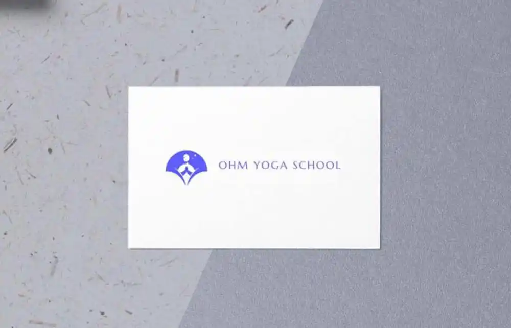
Ohm Yoga School sought a distinctive and clear logo that could seamlessly integrate across their website, social media platforms, and lanyard cards for school entry. By incorporating their primary Pantone color, we crafted a design that embodies the school’s spiritual foundation and modern appeal.
The Ohm Yoga School Design: Merging Tradition with Modernity
Symbolism of the ‘Om’ Character
The logo prominently features the ‘Om’ symbol, a sacred sound and spiritual icon in Hinduism, Buddhism, and Jainism. This character represents the essence of the ultimate reality and consciousness, aligning perfectly with the school’s mission to impart profound yogic teachings.
Integration of Primary Pantone Color
Utilizing the school’s primary Pantone color ensures brand consistency and fosters immediate recognition. The chosen hue reflects tranquility and balance, resonating with the core values of yoga practice.
Versatility Across Platforms
Digital Presence
The logo’s clarity and simplicity make it ideal for digital applications, ensuring it displays effectively on websites and social media profiles. Its design maintains integrity across various screen sizes and resolutions, enhancing the school’s online identity.
Physical Applications
On lanyard cards, the logo serves as a recognizable emblem for students and staff, reinforcing a sense of community and belonging within the school environment.
For insights into designing effective yoga logos, consider exploring this collection of yoga logo designs.
Ohm Yoga School Conclusion
The logo design has successfully bridged traditional spiritual symbolism with contemporary design elements. Its adaptability across multiple platforms ensures a cohesive and harmonious brand presence, reflecting the school’s dedication to imparting authentic yoga education.