Pinnacle 4 Fitness: A Standout Brand in the Competitive Fitness Market
Pinnacle 4 Fitness approached us for a complete branding overhaul, including a logo, branding document, and a fully functional website. With the fitness industry booming, their goal was to establish a quality brand that stood out, was easily recognizable, and resonated with their target audience. This project aimed to create a cohesive and dynamic visual identity that set them apart in their market.
A Modern and Recognizable Logo
Designing for the Fitness Market
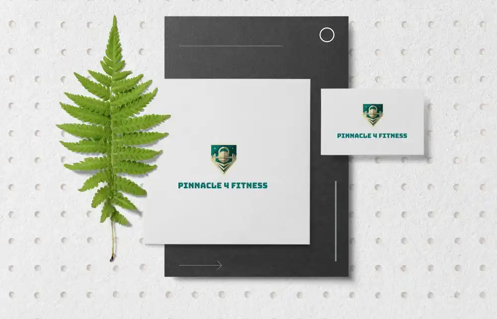
The logo combines strength and motion with a sleek, modern aesthetic. The design reflects their focus on fitness and high-quality services while being clean and versatile.
The Power of Simplicity and Boldness
We chose bold typography and geometric elements to make the logo memorable and professional. This ensures it performs well in a variety of formats, from digital platforms to physical signage.
Branding That Resonates
Color Palette and Typography
The branding document established a dynamic color palette, blending energizing hues like reds and yellows with clean neutrals for balance. The typography was selected for readability and impact, ensuring consistency across all marketing materials.
Defining the Brand Voice
The branding guidelines outlined a tone that is motivational, energetic, and approachable, appealing directly to fitness enthusiasts and potential clients. This consistency helps build trust and recognition in the crowded fitness market.
Website for Digital Presence
A Seamless User Experience
The Pinnacle 4 Fitness’ website was designed by our website design team with user experience at its core. Featuring easy navigation, mobile responsiveness, and clear calls-to-action, it ensures potential customers can find the information they need quickly.
Integrated Branding
The website integrates the new branding seamlessly, from the logo and color scheme to the tone of the content. This creates a cohesive experience that strengthens brand identity.
Why Pinnacle 4 Fitness Stands Out
A Holistic Branding Approach
This project wasn’t just about creating a logo—it was about delivering a comprehensive branding solution. From the design to the website, every element aligns with the brand’s mission to inspire and motivate.
Building Brand Recognition in a Competitive Market
By creating a recognizable and appealing brand, Pinnacle 4 Fitness is well-positioned to attract and retain clients in the rapidly growing fitness industry.
Conclusion: Pinnacle 4 Fitness Branding Success
Pinnacle 4 Fitness now boasts a cohesive brand identity, a standout logo, and a fully optimized website that elevates their position in the fitness market. This project exemplifies the power of thoughtful branding in building recognition and trust.
For more tips on creating effective fitness branding, explore this comprehensive guide to fitness branding.