Heavenly Bakes: A Delectable Visual Identity
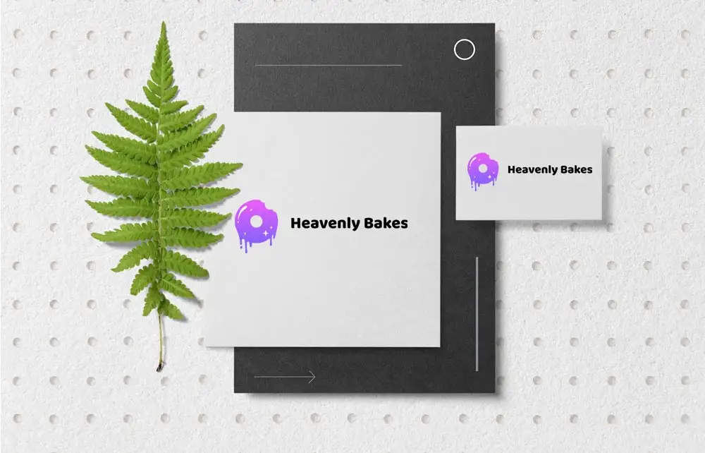
Heavenly Bakes, renowned for its wide array of cakes and pastries, sought a logo that would instantly evoke the delightful experience of their offerings. The chosen design features a mouth-watering donut in the brand’s signature colors, effectively capturing the essence of their delectable treats.
Heavenly Bakes Design Elements: Simplicity and Appeal
The Donut Icon: A Tempting Visual
The centerpiece of the logo is a scrumptious donut, designed to tantalize the senses and stimulate the appetite. This choice not only highlights one of their popular products but also serves as a universal symbol of indulgence and satisfaction.
Brand Colors: Consistency and Recognition
Utilizing the company’s established color palette ensures brand consistency across all platforms. These colors are carefully selected to evoke warmth and sweetness, aligning perfectly with the bakery’s identity.
Versatility Across Platforms
Digital Presence
The logo’s clean and straightforward design translates seamlessly to digital mediums, including the company’s website and social media profiles. Its eye-catching appeal enhances online engagement and brand recognition.
Print Materials
In print, the logo maintains its allure, making it ideal for menus, packaging, and promotional materials. Its simplicity ensures clarity and impact, regardless of size or medium.
For inspiration on creating appetizing bakery logos, consider exploring this collection of bakery logo templates.
Heavenly Bakes Conclusion
The Heavenly Bakes logo masterfully combines simplicity with mouth-watering imagery to create a memorable and effective brand identity. By featuring a delicious donut in their brand colors, the logo not only represents their product range but also entices customers, making it a pivotal element of their marketing strategy.