Local Locks: Distinctive Branding Through Unique Design
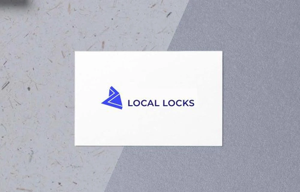
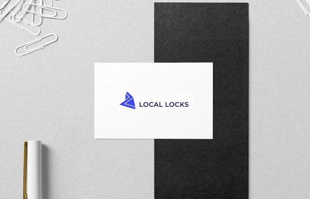
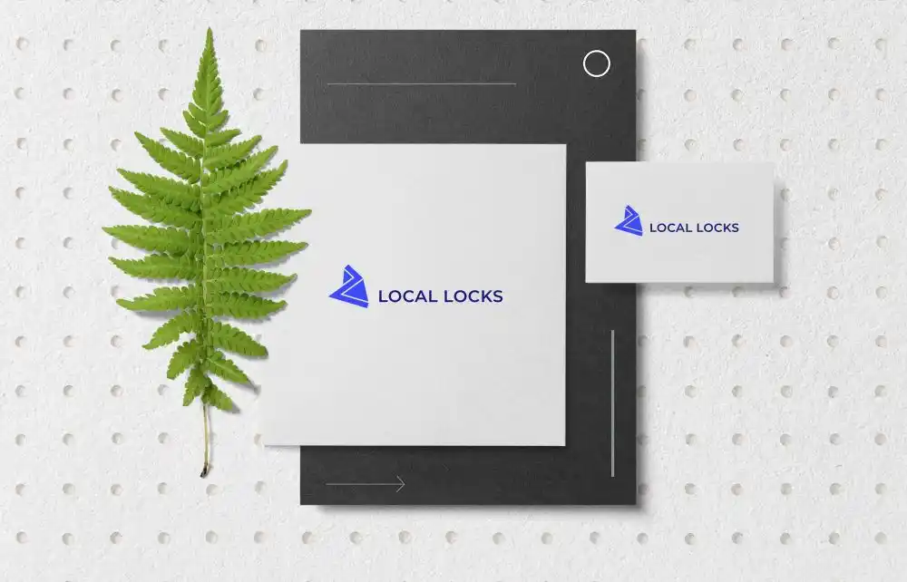
In the locksmith industry, logos often feature traditional symbols like bolts, padlocks, or keys. However, Local Locks aimed to differentiate itself by avoiding these common motifs. Instead, they opted for an abstract shape in a single color, creating a distinctive and memorable brand identity.
The Local Locks Design: Abstract Simplicity
Moving Away from Conventional Icons
By steering clear of typical locksmith imagery, the logo design team created a logo that stands out among competitors. This strategic choice not only sets them apart but also conveys a modern and innovative approach to their services.
The Power of a Solo Color Scheme
Utilizing a single color enhances the logo’s simplicity and versatility. This minimalist approach ensures the design remains impactful across various mediums, from digital platforms to printed materials.
Versatility Across Platforms
Digital Presence
The abstract design translates effectively on websites and social media profiles, providing a cohesive and recognizable online brand presence.
Print Applications
The logo’s simplicity ensures clarity and professionalism on business cards, signage, and promotional materials, reinforcing brand consistency.
For inspiration on creating unique locksmith logos, consider exploring this collection of locksmith logo designs.
Local Locks Conclusion
Local Locks’ decision to deviate from traditional locksmith symbols resulted in a unique and memorable logo. The abstract shape and monochromatic color scheme effectively distinguish the brand, conveying innovation and professionalism across all platforms.