Kot: Crafting a Distinctive and Versatile Brand Identity
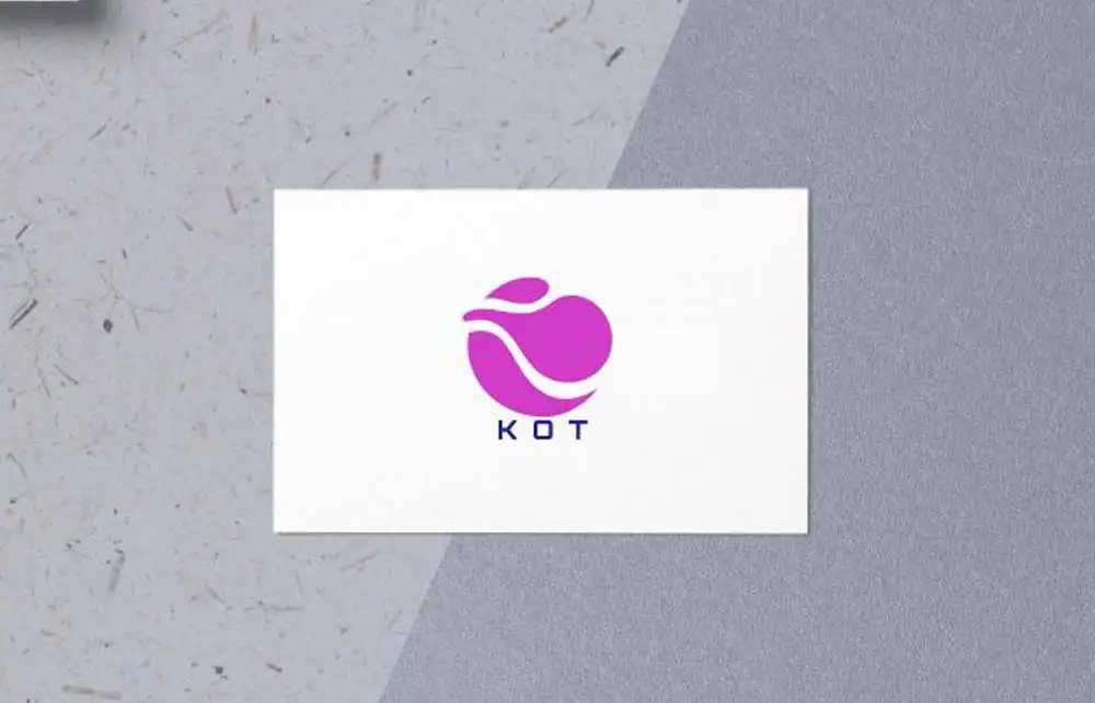
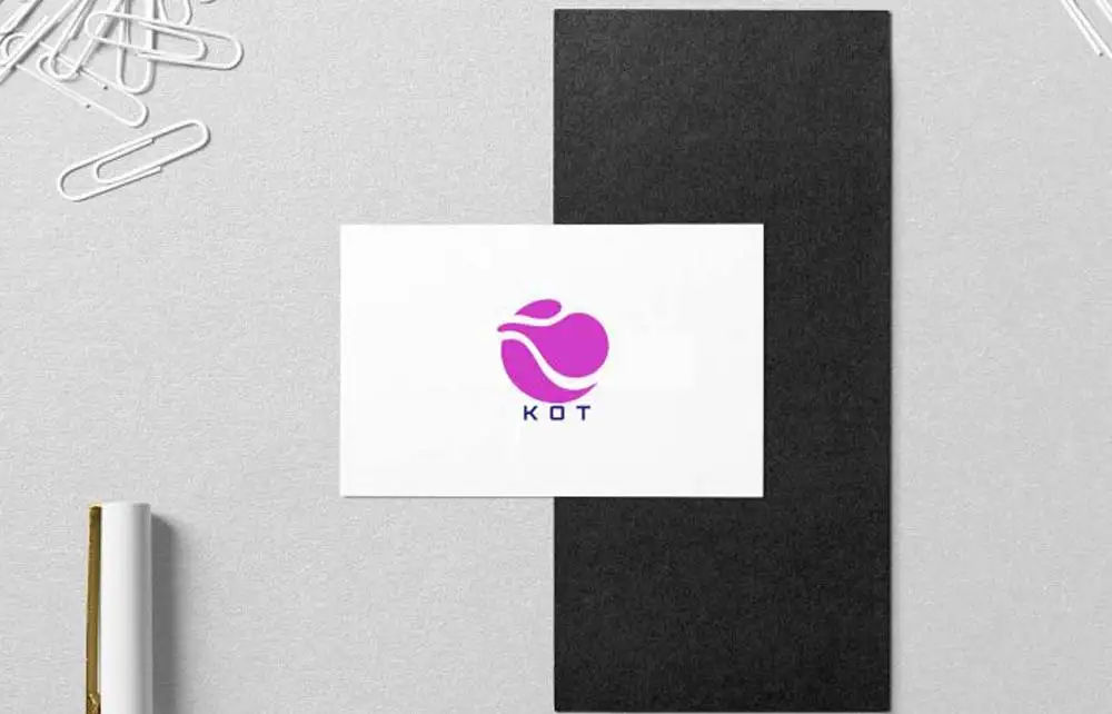
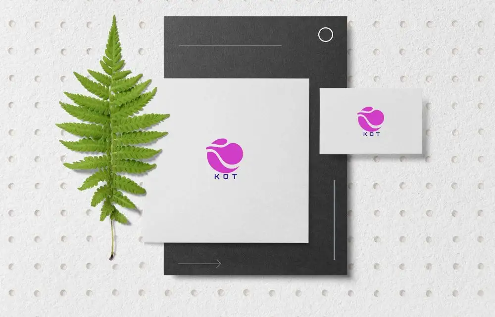
Kot required a logo that would be easily recognizable and adaptable across various media platforms. The resulting design features the company’s initials, “KOT,” integrated into a unique pattern, complemented by strong branding colors. This approach ensures consistency and enhances brand recall.
Kot Design Elements: Simplicity and Recognition
Initials Integration: Enhancing Memorability
The logo prominently displays the initials “KOT,” arranged in a distinctive pattern. This design choice simplifies the brand’s identity, making it easily recognizable and memorable for the audience.
Strong Branding Colors: Establishing Visual Consistency
Utilizing a bold and consistent color palette reinforces the brand’s presence across different media. The chosen colors convey the company’s personality and values, aiding in creating a cohesive visual identity.
Versatility Across Media Platforms
Digital Applications
The logo’s clean and straightforward design ensures optimal display on digital platforms, including websites, social media profiles, and mobile applications. Its simplicity allows for quick loading times and clarity on various screen sizes.
Print Materials
In print media, such as business cards, brochures, and promotional materials, the logo maintains its integrity and impact. The distinctive pattern and strong colors ensure it stands out, facilitating immediate brand recognition.
For further inspiration on crafting distinctive logos, consider exploring LogoLounge, a comprehensive resource for logo design trends and ideas.
Kot Conclusion
The Kot logo effectively combines simplicity with a unique pattern design, utilizing the company’s initials and strong small business branding colors. This strategic approach ensures the logo is easily recognizable and versatile across various media platforms, reinforcing Kot’s brand identity and enhancing audience recall.